
Domain Expertise, AI Tools and Climbing
AI tools are amazing but they still necessitate domain expertise and guidance. You can show this in lots of ways, most easily by picking an out-of-distribution domain or task, but I wanted to share a simple but immensely useful personal example.
A few years ago I injured a tendon in my finger and forearm while climbing. Tendon finger injuries are tricky to heal as you need to use it to heal it but our bodies aren’t very good at telling when you’ve used it too much. So, I reinjured it a few times and ended up scared to climb properly.
It’s a bit of a dilemma, I needed to climb enough to actually heal my finger but not too much to injure it again. The solution? Track how much I could safely climb in one session and go a tiny bit harder next time.
I made a messy table in a notes app, optimised for quick input over cleanliness, and tracked attempts and tops per grade. I then tried to use AI to visualise my progress over a few months.
First step, clean the data. AI was very bad at this.
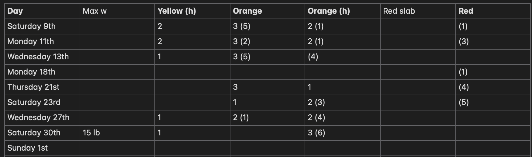
As the domain expert of my own data, only I knew that brackets were attempts, that empty rows were when I forgot to track, how colours translated to climbing grades, and what date I started tracking. However, even after providing this information, AI struggled to write code that could meaningfully clean the data and I had to step in.
It may seem like I have arbitrarily chosen a bad format but remember I was optimising for ease of input and I simply didn’t want to have to think about it when I made it. So much real world raw data is like this.
Next step, visualise progress. Unguided the AI was pretty bad at this. Guided it was very good.
At first I tried explaining what I wanted at a high level: climbing progress over time based on grades, attempts and tops.

This... wasn’t ideal. It does indeed show all of the information I asked for but it’s messy and hard to interpret. Data visualisation should be beautiful! Thankfully, after this plot, it suggested trying a stacked bar chart and I agreed.

After some prompting to also include attempts we get a much nicer plot. I was pleased to see it had no problem dealing with the fiddly code required for grouped stacked bar charts.
This is progress but it still doesn’t get at what I initially wanted, which was to quantify finger stress over a single session. For that I suggested we try a simple weighting system where harder grades are more stress and attempts are less stress than tops. I left it up to the code assistant to decide on the weighting system and plot.

Much better! It opted for a simple weighting system where attempts are a 1/3 of the stress of tops and each grade is one point more stressful than the last. It also chose to plot a 3 session moving average to smooth out the curve and show individual session scores using a scatter plot. Very nice.
However, I still cared about the kinds of grades I was climbing. In this plot, you can get the same stress score with lots of easy grades or a few hard grades. This is a fine indicator of stress in some ideal weighting system but I also wanted to track my climbing progress over time. Additionally, the previous plot does not portray rest between sessions even though that information is inherently present in the date data.
I suggested we include each grade’s contribution in the plot and have the x-axis reflect true time.

Great! We now have a 3 session moving average for each grade and the x-axis is no longer categorical. I was happy to stop here, all of the information I asked for is nicely shown in the plot. But, we can make it prettier.
Stacked area charts, whilst sometimes deceptive, are a great way to show total change in a metric as the contribution of each category. I couldn’t remember the exact name of this plot but the AI assistant easily knew what I was talking about from a description.


At first it gave me the plot without a moving average but it was simple enough to ask for an optional param to switch between the two.
Finally, I wanted to bring it back to raw attempts and tops and it was happy to oblige.

Super happy with these last plots. I can see what proportion of my session was formed of which grade, the amount of attempts and tops, how often I climb, and the stress on my finger.
Conclusion
This example is admittedly somewhat trivial and I am stretching the definition of domain expert. But it did highlight to me just how much, even for something seemingly so simple, I had to jump in and guide it.
I am very glad that I completed my PhD without AI tools. Would I have done more with them? Almost certainly. Would I be a worse programmer, AI engineer, and data scientist? I think so.
I’m not sure what this means going forward. As more people rely on these tools to augment their productivity and learning will we have fewer domain experts? Is familiarity with prompting a more useful skill than knowing how to do it yourself? Will models get so good that we truly do not need to guide them anyway? They guide us? I’m torn on these questions.
Happy to say after all this that my finger feels fully recovered!